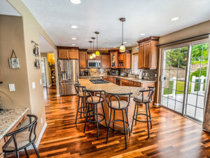
What many homeowners tend to overlook in home design is the stop-look-and-edit habit. Sometimes, you can get so caught up with the details of the space that you forget the big picture, how one element relates to another, what style you’re trying to achieve, or how the entire room feels like already.
It’s important to stop, look, and edit — precisely because there are things you can take out or improve. You want to do this especially when you’re trying to achieve a minimalist home, where the core principle is simplicity. That said, as you edit your space, ask yourself these questions:
Are the colours distinct?
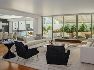
Minimalist interiors often have tone-on-tone palettes to maintain a clean, crisp look. This is all good, except when the hues, which look very similar to each other, become a little too flat-looking. Even though you have shades of the same hue, you can keep them distinct from one another. One way you can do that is to balance out the heavy and light tones.
If you have deep brown on your walls, the furniture near it, say, the sofa or the console tables should have a lighter touch of brown. This way, both elements match each other, but not blending totally. Another way you can make the colours distinct is by picking out different textures. A brown brick stone finish on the walls will be easily distinct from a brown wood grain material on your cavity sliding doors. Melbourne-based interior designers highly recommend mixing and matching various textures in your room for better visual appeal.
Where’s the negative space?
Lots of negative space are essential in minimalist rooms. Survey your walls. Which of those art pieces or picture frames can go? Look at your center table. Which of those trinkets, the books, the vases, or the candles can be taken out? Consider the entire room, of course. Which furniture you can give up to clear pathways? While you’re prioritizing negative space though, don’t neglect the positive space, too. Ask yourself if you’re making the most of that area. As you only have a limited number of stuff to put in there, make sure that such elements are highly functional and aesthetically pleasing. Look for multi-functional pieces: seating furniture that has storage areas, tables whose surfaces flip as a mirror, artwork that hide switches and cables. The principle is, while you’re freeing up lots of areas for negative space, make sure that the areas you’re filling up with for positive space have interesting pieces.
What’s your focal point?

While every home design has to have a focal point, it’s much more important in a minimalist space because the style banks on the principle of simplicity. Having that ‘star’ in the room — that statement element — can help in achieving that uncomplicated, straightforward style. When you survey a room in your home, once you step inside it, ask yourself if the supposed focal point has caught your attention. If it hasn’t, you probably had to define it further by re-orienting furniture towards it or clearing sightlines from the usual viewing spot. Your home design project doesn’t stop at the accents and decor. When the last candle or vase has been put down on the table, it’s time to stop, look, and edit.


